The Problem
Create an engaging experience

BNY Mellon was looking for an interactive app that would allow users to take a holistic approach to wealth planning through thier 5 Active wealth practices – where they help users not only build lasting wealth, but make sure that your wealth works to supports life well lived.
This app will give the users insight into their wealth management strategy, while demonstrating the importance of financial health to their overall well being by contacting a Wealth Management consultant and start their journey.
The Experience Design Team
| Design: Director of Experience Design ACD Experience Design (Me) ACD Visual Design Content Director |
Engineering: Director of Technology Director of Enigeering React Engineers (2) |
Awards

Honoree
Websites & Mobile Best Visual Design/Function
Audience Honor
Data Visualization, UX/UI, Customer Service
Gold
Digital Media and Integrated Marketing
Apps & Tools
Gold
Display Rich Media
Consumer Retail
Discovery
What makes a good interaction?
Looking at some best in class quiz flows.
When we met with the client to review what kind experience they wanted for this Wealth Health quiz, we noticed that there were many ways to move users through with ease
We looked at LadyBird Movie, Career Explorer, Google’s energy quiz as well as tinder to fully understand what would be the best path forward for us.
The key take aways were:
- Swiping motion lead to an easy to understand navigation
- Fun animations will bring the experience to life and keep the user engaged.
- Bringing surprise and delight moments in between questions to educate the user along the journey.


Discovery
Getting the user through to the quiz: Examining how do the users enter the experience.
We wanted to look closely at how the user were getting into the experience to determine if this was going to be a mobile first approach or desktop.
We worked with the client and learned that most of the traffic would be coming from ads on platforms like linkedin and social as well as emails going to personal accounts. This solidified the Mobile First Approach.
While we examined the journey we also wanted to ensure there were plenty of direct links to app from the main wealth website, a custom landing page, as well as to create banners for other BNY Mellon sites.
Discovery
Understanding the users flow: Setting the standard of the questions.
As we established the user journey, we started to look into what is going to be the core functions of the application.
While working with the client we defined a how many questions the users would see and where the ‘surprise and delight’ moments would appear. This lead us to the user moving through each category, and having the feature sections rotate around so it wouldn’t bore the users.
Once we built that cadence, we added in the pages that would complete that flow, making sure the users understood how the app worked and how the users would contact a wealth representative.


Design
Defining the interactions: Keeping the user engaged, entertained and educated.
As we started the design phase we created wireframes to work through a wide range of solutions around each part of the experience.
From keeping the start button in clear view on the homepage to understanding the progress bar throughout the app the experience design team worked with the client to get the pieces into place.
Along with getting the wireframes established the content team started to write the information for each question, the surprise and delight moments as well as how the user understands their score.
These all came together for us to validate the flow and get the wireframes ready for visual design.
Design
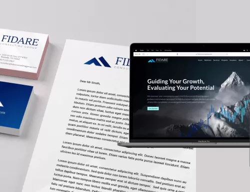
Adapting the new DLS: Giving the app a layer of brand consistency
We entered the visual design part of this project being able to adapt a brand new design language system that our team created for BNY Mellons rebrand earlier in the year.
This design language system brings strong brand elements, patterns and typography.
While these are master brand elements, the Wealth Management sites were not poised to launch them until later in the year. So the plan was for this app to be the first piece in wealth launching with the new brand design.


Design
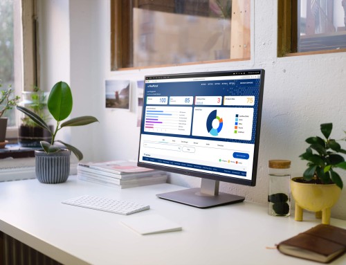
Bringing the app to life: New design system, animation and interactions fuels success.
As the visual design team adapted the design language to the app, we worked through some final interactions and animations that we locked into place.
Interactions like the sticky call to action, how the users will interact with the chart and if we time the helpful tips when they are on the screen where our last series of elements to get ready to hand off to development team.
There were some tech considerations to work around with the swipe functionality, the data pulls for the final results screen, and how the responsive nature of the application. All issues were brainstormed and resolved together.
Outcomes
Final stats: How did the app perform with users?
Propelled by an omni-channel digital marketing campaign, we were able to drive significant engagement with the Active Wealth Accelerator among our very narrow target audience of high-net-worth individuals, resulting in:
$31M
in pipeline from qualified leads over 2 months
3Min
average interaction time
+50%
Completion rate 2500 out of +5000 users
850+
contact forms submitted