New Path to Acquisition

While we were reestablishing the American Express Global Commercial Journey, we realized there was a big piece missing.
‘An overall homepage that can guide the user to the correct path. We conducted user research that confirmed our hypothesis. A lot of users found the current experience difficult to navigate and they did not understand the full breadth of the Business Program.
So I worked with the marketing, product and engineering teams to design a page that would scale and increase acquisition for our group.
Version 1
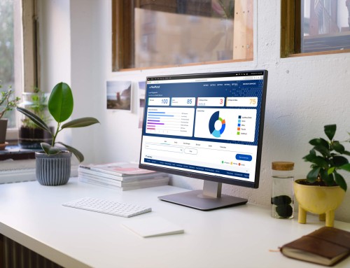
Creating a new homepage for a new sitemap
We thoroughly user-tested this homepage. The first round was to establish if the users prefer how the content is presented.
There was a big debate as a team if the users would prefer a Product focused approach vs a self-identification based on their business size. These tests provided insight that would later affect the sub-navigation.
The outcome was that the ‘Size based‘ design was better received as well as more intuitive to the users but the content from the ‘Product based’ was more relevant to what they are looking for.
We went live with a combination of both pages and saw an increase of interaction with items like the quiz as well as traffic towards non-card product pages.
Original Sketch

Product based design

Business size design

Original Sketch

Final design

Version 2
Moving to a modular look for a custom experience
We continued to look at how we were going to grow the business further with smarter experiences, and give the users a clearer path for success.
At this time we were launching all refreshed versions of the non-card card products that were acquisition drivers for the team.
So I cleaned the up look the page to a ‘less is more’ style as we also changed the purpose of the page to push them down the funnel and continue to add educations pages throughout.
We also added the blog to all pages within the journey that would be contoured to the page they are looking at and if they are on the fence it helps the user understand the benefits.
Personalization
Custom built to scale page for all card members
So as we launched the new design for the page we set our focus to make the page custom for cookied and logged in users. I worked with the product, marketing and development to first see what info we can propagate on the page.
From marketing there was a big focus on adding card members, upgrades & the refer-a-business program.
Once we figured that out, I went into all the modules figuring what to show where that still made sense to the users and didn’t disjoint the experience.

Final Page

Personalized modules
← Custom Hero:
This section shows cards on the account along with a CTA to add employees to your account
← Flex Modules:
This area would be fully content driven to show users new offers, new products as well as link them to upgrade their account
← Card Offers:
To entice the users to add cards to their wallet we added a special offers for them.
← Articles for you:
By understanding what the users business was and how they spend the articles would reflect these types of themes.